
When developing a game interface in Unity, relying on the default rounded grey rectangle for user interaction makes even the most mechanically polished project look unfinished. Replacing the standard UISprite with a custom button texture in Unity is essential for establishing visual hierarchy, reinforcing game atmosphere, and providing tactile feedback during player navigation.
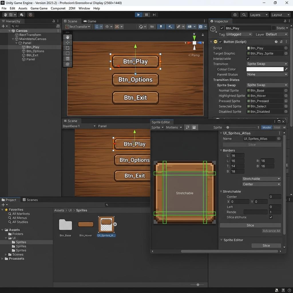
Configuring custom UI sprites with 9-slice borders inside Unity’s Sprite Editor allows buttons to scale dynamically across different screen resolutions without stretching.
However, simply importing a custom PNG graphic and assigning it to an Image component inside a Canvas often leads to blurry edges, severe stretching when UI panels resize across different aspect ratios, and unnecessary draw calls. Below is the complete professional guide to importing, slicing, and configuring custom button textures in Unity so your interface remains crisp, responsive, and performance-optimized across desktop, mobile, and console screens.
Why Standard Image Textures Look Blurry on Unity Buttons
When you drag a standard texture asset into Unity and drop it straight onto a UI Button component, the engine applies default 3D asset import rules. Three common configuration bottlenecks cause UI button artwork to look degraded or behave unpredictably:
- Incorrect Texture Type: Unity defaults new image assets to
Default (sRGB)texture type, which generates mipmaps and applies trilinear filtering designed for 3D world surfaces rather than sharp 2D pixel boundaries. - Lossy Compression Artifacts: Mobile and desktop compression formats like DXT5 or ASTC compress color blocks across
4x4pixel clusters, resulting in noticeable muddy artifacts around sharp text borders and beveled button edges. - Absence of 9-Slice Margins: When a button changes width to accommodate localized multi-language text (for example, expanding from English
PLAYto GermanWEITERSPIELEN), an unsliced texture stretches horizontally, warping corner bevels and ornamental frame borders out of proportion.
[Unity UI Button 9-Slice Scaling Architecture]
Original Sprite Texture (e.g., 256x128)
┌─────────┬──────────────────┬─────────┐
│ Corner  │   Top Border     │ Corner  │  ──> Corners remain fixed in pixel size (1:1)
├─────────┼──────────────────┼─────────┤
│ Left    │  Center Fill     │ Right   │  ──> Borders stretch along single axis (X or Y)
│ Border  │  (Tiles/Stretches)│ Border  │  ──> Center stretches to fill dynamic dimensions
├─────────┼──────────────────┼─────────┤
│ Corner  │  Bottom Border   │ Corner  │
└─────────┴──────────────────┴─────────┘
Step-by-Step Guide to Setting Up Custom Button Textures in Unity
To build clean, scalable interactive buttons that adapt seamlessly to different Canvas resolutions, follow this three-step implementation pipeline.
1. Configure Import Settings for Crisp 2D UI Sprites
- Copy your designed button graphic (
Button_Normal.png) into your Unity project’sAssets/UI/Buttons/folder. - Select the image asset in the Project window to open its properties in the Inspector panel.
- Change Texture Type from
Defaultto Sprite (2D and UI). This unlocks UI-specific slicing utilities and canvas rendering features. - Set Sprite Mode to Single (or Multiple if you packed several button states into a single sprite atlas).
- Uncheck Generate Mip Maps. Mipmaps are intended for 3D objects that move away from the camera; leaving them enabled on 2D screen-space UI doubles texture memory and blurs artwork on scaled canvas elements.
- Under the platform-specific compression tabs (PC, Android, iOS), set Compression to High Quality or None if the button features delicate line art or high-contrast gradients that suffer from blocky banding. Click Apply.
2. Set Up 9-Slice Slicing for Scalable Button Borders
- With your imported sprite selected, click the Sprite Editor button in the Inspector panel. (Note: If this button is disabled or missing, install the
2D Spritepackage via Window > Package Manager). - Inside the Sprite Editor window, look at the four green margin lines (top, bottom, left, and right borders).
- Drag the green border lines inward from the edges (
Border L/R/T/Bparameters in the right panel) until they enclose exactly the decorative corner curves, bevels, and drop shadows of your button graphic. For a standard rounded button with a16pxcorner radius, set Left, Right, Top, and Bottom borders to16or20. - Click Apply in the top-right corner of the Sprite Editor and close the window.
- In your Canvas hierarchy, select your UI Button object. Ensure the attached Image component has Image Type set to Sliced (instead of
Simple). Now, resizing the button’s Width or Height via the Rect Transform stretches only the flat central region while preserving crisp, undistorted corner proportions.
3. Wire Transition States (Normal, Highlighted, Pressed, Disabled)
- Select your UI Button in the Canvas hierarchy and locate the Button component in the Inspector.
- Check the Transition property dropdown. While
Color Tintworks for simple tinting, switching to Sprite Swap allows you to substitute completely unique hand-drawn textures when the player hovers or clicks. - Drag your primary sliced sprite into the Target Graphic slot attached to the Button’s Image component.
- Under the Sprite Swap properties, assign your state-specific sprite assets:
- Highlighted Sprite: Assign
Button_Hover.png(featuring a brighter glow edge or lifted drop shadow). - Pressed Sprite: Assign
Button_Pressed.png(visually inset by2pxwith darkened interior bevels). - Disabled Sprite: Assign
Button_Disabled.png(desaturated grey tone with low opacity).
- Highlighted Sprite: Assign
Summary Table: Unity UI Button Texture Reference
| Parameter Setting | Recommended Value | Technical Rationale |
|---|---|---|
| Texture Type | Sprite (2D and UI) | Enables Sprite Editor slicing and exposes UI Canvas rendering attributes |
| Generate Mip Maps | Disabled (Unchecked) | Saves 33% texture memory and prevents Canvas scaling from triggering blurry lower mip levels |
| Filter Mode | Bilinear (Standard) or Point (Pixel Art) | Bilinear keeps smooth curves crisp; Point (no filter) ensures sharp pixel art boundaries |
| Image Type (Image Component) | Sliced or Tiled | Prevents corner bevel stretching when button dimensions dynamically expand for localized text |
| Canvas Scaler Mode | Scale With Screen Size | Keeps physical UI button dimensions proportionally consistent across 1080p, 1440p, and 4K monitors |
Generating Stylized Material Panels and UI Backgrounds
While individual interactive buttons require clean 9-slicing and precise transparency, surrounding UI frames, dialog boxes, and menu backdrops often benefit from rich physical texture detail. Adding subtle brushed metal patterns, carbon fiber weaves, or embossed stone surfaces underneath your UI elements transforms flat menus into deeply atmospheric diegetic interfaces.
If you want to create custom tileable backgrounds and textured frames for your Unity UI panels without manually tiling patterns in Photoshop, upgrade your interface design pipeline with our Seamless Texture Generator Online. You can also generate crisp normal maps to add real-time dynamic UI lighting across your menu boards using our Free Online Normal Map Creator — Try Textured Leather Panel.
Unity UI Button Texture Quick Checklist
- Asset imported with
Sprite (2D and UI)Texture Type. -
Generate Mip Mapsexplicitly unchecked. - Green 9-slice borders configured cleanly around corner bevels in
Sprite Editor. - Attached
Imagecomponent set toSliced(Image Type). - State transition mode configured (
Color TintvsSprite Swap) with matching sliced states.
Related reading: How to Use Normal Maps in Unity and UE5 · Why Adding a Texture Makes Your VRChat Avatar Invisible · What is a Normal Map? · Roughness Map Guide